

Human/AI Widget
The Human/AI widget is a floating toggle that lets visitors switch between the normal page and its AI-readable markdown version.
How it works
Section titled “How it works”When a visitor clicks AI, the widget:
- Fetches the
.mdfile for the current page - Falls back to extracting markdown from the live DOM if no
.mdexists - Displays the markdown in a slide-out panel
- Offers copy-to-clipboard and download actions
Automatic injection
Section titled “Automatic injection”Framework plugins (Astro, Vite, Nuxt, Angular) inject the widget automatically. No extra code needed.
Manual setup (Next.js / React)
Section titled “Manual setup (Next.js / React)”For Next.js or other manual setups, create a client component:
'use client';import { useEffect } from 'react';
export function AeoWidgetLoader() {  useEffect(() => {    import('aeo.js/widget').then(({ AeoWidget }) => {      new AeoWidget({        config: {          title: 'My Site',          url: 'https://mysite.com',          widget: { enabled: true, position: 'bottom-right' },        },      });    });  }, []);  return null;}
Framework components
Section titled “Framework components”aeo.js ships React, Vue, and Svelte wrapper components:
import { AeoReactWidget } from 'aeo.js/react';
<AeoReactWidget config={{ title: 'My Site', url: 'https://mysite.com' }} /><script setup>import { AeoVueWidget } from 'aeo.js/vue';</script>
<template> <AeoVueWidget :config="{ title: 'My Site', url: 'https://mysite.com' }" /></template>Configuration
Section titled “Configuration”widget: { enabled: true, position: 'bottom-right', // 'bottom-left' | 'top-right' | 'top-left' size: 'default', // 'small' | 'icon-only' humanLabel: 'Human', aiLabel: 'AI', showBadge: true, theme: { background: 'rgba(18, 18, 24, 0.9)', text: '#C0C0C5', accent: '#E8E8EA', badge: '#4ADE80', },}Size variants
Section titled “Size variants”| Default | Small | Icon |
|---------|-------|------|
| 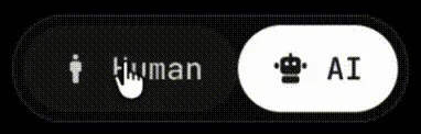 |
|  |
|  |
|
|
| size: 'default' | size: 'small' | size: 'icon-only' |
| Full labels with icons | Compact — ~30% smaller | Just icons, no labels |